

I’m super excited today to take you inside the studio of my design collaborator and good friend Jon Flannery, founder of Cryptogram. I announced earlier this week that we are doing a special giveaway right now for a limited edition THERE IS NOTHING STOPPING YOU (#tinsy) poster that Jon created. (Simply subscribe to our community by February 15th to get your name entered.) In today’s post you’ll get a look inside Jon’s studio space and see how the poster was made. I’ve got to say it was super fun to see what it takes to go from idea to art object. Are you excited yet?!
I’ve had the good fortune to collaborate with Jon since the founding of Point Road Studios back in 2012. Like my best creative collaborations, our work together feels fluid, organic, and easy. When I was printing business cards many moons ago, Jon knew just the vintage paper I would love. (It was an abandoned ream that had been sitting in storage at a letterpress studio he collaborates with. It appealed to me both aesthetically and ethically.) When I wanted to create something special to honor the launch of the new pointroadstudios.com, I knew just where to turn.
Jon lives and works in Cincinnati, Ohio so – as a DC-area lady – we do almost all of our work together virtually. But not for this project. The especially fun part of this collaboration was that I got to be there in person to experience the printing process thanks to a timely trip home for the holidays.


While I showed up to see Jon at work, it was also fun to see his new studio space. Wanting to have a better set up for his printing work, he recently opened up shop in a lovely space in one of my favorite neighborhoods in Cincinnati’s Northside. (Colin and I were married in this hood nearly a decade ago and my mom grew up here.) Between being a junkie for seeing where creatives get their work done and being in the midst of setting up my own new office space, this was a real treat. (Side note: If you love seeing creatives at work, check out Grace Bonney’s latest book In the Company of Women. It’s awesome.) Jon is still getting the shop set up and it’s got great bones and high function. I can’t wait to see how the space continues to evolve over time.


Also, funny story. I “found” Jon when I was walking early one morning through Northside. I’d founded Point Road earlier that month and was wandering for inspiration when I stumbled across Cryptogram’s then-studio. I was immediately taken by the storefront’s clean lines and the compelling logo, which said underneath it, “a fine design and print studio.” The door was locked, but I was hooked. I reached out to Jon by phone when I returned home to DC. By the time he and I connected a couple of week’s later to discuss brand identity, he was no longer in that space. Proof that sometimes the thing you need stumbles in front of you at just the right time.


Okay, so let’s talk process for printing. Before ever walking into the studio, Jon and I had brainstormed about how this project might take shape. My core vision was a limited edition screen print with the message there is nothing stopping you. I wanted the words to take center stage but the design to be a compelling piece of art on its own. Jon took that idea and ran with it. He came back to me with several designs and after discussing we both agreed on the final design. From a size perspective, he really advocated for a poster size and I liked the idea. Jon’s portfolio includes many a poster for bands and other rock and roll types and I love how he riffed on that aesthetic here. The poster’s vibe also helped us land quickly on paper type; something weighty and substantial but not overly precious or textured.

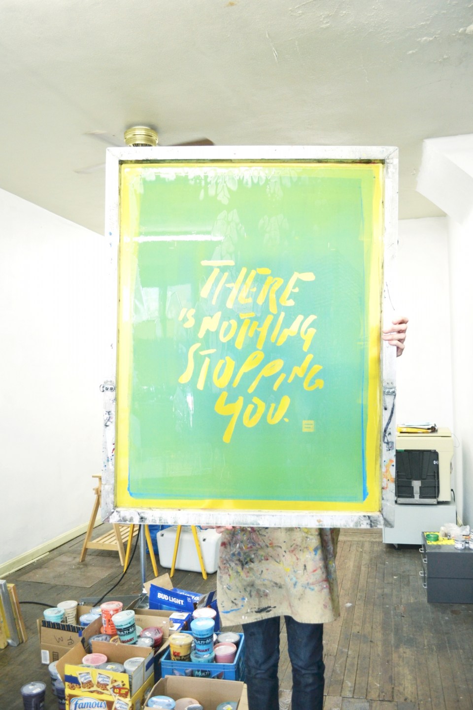
With the blank canvas and design in place, it was printing time! I’ve never seen or done screen printing before and I was amazed at how many steps there are in the process. First the films for the design must be made. Picture black imagery/text on top of an old-school overhead transparency. For those of you staring blankly at the screen wondering what an overhead transparency is (doh!), imagine a thin, clear, flimsy sheet of plastic. Here you can see one of the films up close and then both films drying on the giant drying rack. It struck me right away in watching this process unfold how much time is spent waiting (e.g. for films, screens, and paint to dry, for films to transfer onto the screens, etc). It reminded me of one of the things I loved about spending time in the photography dark room in high school and college: It forced me to slow down and wait.


With the films made and dried, Jon was then able to move on to creating the screens. Jon uses a technique to expose the screens using a photographic emulsion. There are different options, I learned, for what color photographic emulsion you can put on the screen to optimize the look you want for print itself. Before even putting on the emulsion the screen itself must be prepped. And then once you’ve imprinted the screen with the film, it has to – you guessed it – sit and wait for the exposure to occur. This happens in a dark room setting. Once exposed, the screens must be rinsed off and then finally allowed to dry. (Are you beginning to sense how time intensive this process is? Phew!)


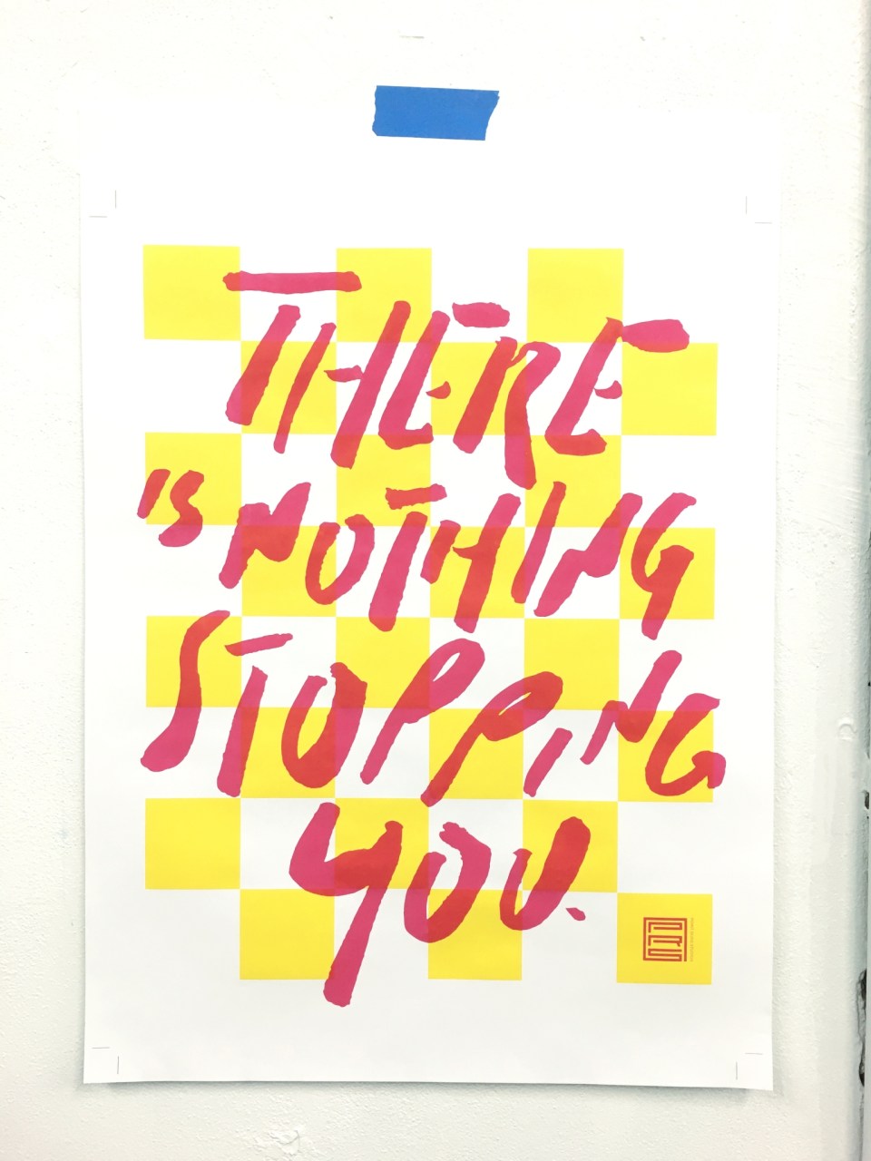
While the screens dried, Jon got to work on mixing the paint colors for the prints. He’s got some expert matching ability and I really appreciated the intensity and depth of color that he achieved. This TINSY poster used two colors, one for each of the screens/layers. Because there is some overlap between the two, a subtle third color is created in the process.


With the screens created and colors mixed, Jon was now ready to actually begin the multi-step printing process. Hooray! As with each step, there is prep involved before you can actual pull the paint over the screen and onto paper. But Jon works both efficiently and meticulously. He set the screen on the press, made sure the alignment was spot on, laid out the paper, then created a map for where each piece will go, and then did a test print. He runs test prints using older test prints and these eventually create a pretty cool piece of artwork all on their own.


Once he confirms the test print looks right, he can move on to creating the first layer of the print itself. For this poster, we decided to do a limited edition run of 45 posters. So this meant 45 times pulling each print for each layer. As you can see above, it’s a full body workout to pull the paint over the print. (Maybe a side benefit of being a screen printer is that you don’t need to join the gym?) Each of the prints must be dried between printing layer 1 and layer 2. It was around this time that I had to head out from the studio (aka when my toddlers woke up in the car from their naps and their super-dad cried “uncle!”). But Jon kept on with the process (and kindly took some photos for me too). After all the first layers were dry, he began adding in the second layer and making the finished product. Which I LOVE!


I hope you enjoyed getting this glimpse into Jon’s studio and the making of the TINSY poster as much as I enjoyed creating it. (Don’t forget you can win this print for yourself!) For me, understanding the story and person/s behind a work of art (whether visual piece like this or a change initiative inside an organization) always gives me a deeper appreciation for the spirit of the thing itself. I hope it will do the same for you.
Oh and I almost forgot. Two last steps in finalizing this poster. 1) Jon signed and numbered each one – because that’s what you do with art, amirite?! 2) Finally: Celebrate copiously! Cheers!